NM2208 - Ng Yew Chong's Learning Journal
Sunday, April 10, 2011
Assignment 5 - Climate Change (Final)
The design technique I applied for this assignment is Gestalt's principles of perception. The contrast between before and after deforestation. The left half of the tree with leaves on its branches on a light blue background is the state before deforestation while the right half of the tree with no leaf on its branches on a subtle red background is the state after deforestation has taken place. The transition from a healthy tree to a dead tree.
article source:
http://www.buzzle.com/articles/causes-and-effects-of-deforestation.html
http://www.wrm.org.uy/bulletin/5/Indonesia2.html
Saturday, April 9, 2011
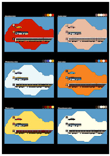
Assignment 4 - Color Coalition (Final)
Color exploration:
For this assignment 4, I want to create the awareness of the uses of ezlink card on the public transports to the young target audiences. I decide on a local theme because most of the times I travel to and back from school via bus and mrt. The actual postcard is the cut out shape of Singapore map. The blue background is unwanted areas but it can be used both ways to cut out the Singapore shape or leave it as it is.
Friday, April 8, 2011
Assignment 3 - U C What I C (Final)
The shots are taken with Sony DSC-H1 5.1 megapixel digital camera. The numberings on the bottom right corner of each photo indicates the hierarchical orders of the photo sequence. The photo sequence is fairly straightforward. Can U C What I C?
Wednesday, April 6, 2011
Assignment 2 - Less Is More (Final)
This is the abstraction process for my assignment 2. For this version, I still stick to the two celebrities I used before in the old version of my assignment 2. First, I traced out the details of the faces of both celebrities. Then I start reducing the minor details while maintaining the distinct features of their faces. I chose the second last frame of reduction process as my final prototype.
The design technique I used for this assignment 2 is the Gestalt's principles of perception. The contrast look of both characters. Martial arts movie stars from the East and the West fighting each other. I chose red color for the foreground silhouettes as red color shows the intensity of the combat.
Final Project
For the final project, we are tasked to work in groups of 3-5 members to create an e-book on food theme. There are 2 options to choose: either children storybook e-book or comic e-book. For our group, we chose to create a children storybook e-book. My group members are Andrea Loh, Shireen and Keng Kok. Although the final project is a very heavy workload, our group managed to pull off. It was an enjoyable teamwork, we learnt alot from one another not just about nm2208 but other stuff too. You may view the e-book from the url link below.
HTML Link:
http://nycuser.fileave.com/main.swf
Below are the children storybook e-book in jpg format in case the url link above doesn't work.
HTML Link:
http://nycuser.fileave.com/main.swf
Below are the children storybook e-book in jpg format in case the url link above doesn't work.
Tuesday, April 5, 2011
Personal Work
These are some drawings I did a few years ago. Most of the times when I am very bored, then I reference some of the comics or photos and sketch the images.
Thursday, March 24, 2011
Assignment 1 - Me, Myself and I (Final)
The initial design of the mecha was to make it look like a mix of dragon and mecha. As Bruce Lee's name has a "dragon" chinese character. Thus, I thought of coloring the armor of the mecha with the color of the scales of standard chinese dragon. During the critique session, the class suggested using either the space or battleground as background. I chose the space as the background because of its dark color that will bring out the metallic looks on the mecha.
Subscribe to:
Comments (Atom)


